


As the founder of AIR, one of the top two modeling companies, and its CEO for 20 years, I spent much of my career informing insurers and reinsurers about catastrophe models and extolling the virtues of model output—i.e., exceedence probability (EP) curves. Relative to the information available before catastrophe models, EP curves were a major advancement.
Executive Summary
The catastrophe model-generated EP curves—and more specifically the “probable maximum losses” (PMLs) derived from those curves—provide only a partial picture of a company’s large loss potential. Adding newer information on return period events, where the probabilities are based on the hazard versus the loss, gives more insight into tail risk and provides advanced metrics for monitoring “informal” risk tolerances. This article illustrates how one chart can summarize multiple risk metrics for a succinct and complete picture of your company’s catastrophe loss potential.After starting Karen Clark & Co. (KCC) and entering the real world of insurance company executives and boards who rely on the model output, I learned a few things. For example, there is still some confusion about what EP curves, and particularly the PMLs derived from these curves, represent.
I’ve also learned that model EP curves do not give senior executives and boards of directors all of the information they’d like to have for risk management purposes. While the EP curve output is valuable for monitoring your formal risk tolerance statements, most companies also have “informal” risk tolerances they’d like to manage.
Partly because it’s easily derived from model EP curve output, the 100-year PML has evolved as the most important risk metric used by senior management, rating agencies and regulators. Along with the 250-year PML, it provides the basis for most formal risk tolerance statements. Despite the importance of this metric, you frequently hear the 100-year PML expressed incorrectly as the 100-year “event.”
The 100-year PML does not represent a 100-year event but is simply one mathematical number from a loss distribution generated from simulating many random events. It’s the point on the EP curve that represents a 1 percent chance you will have that loss or greater.In fact, the chance is almost 1 percent that your loss will be greater, and there’s a significant chance it will be much greater.
The way the PML is used today, it’s easy to forget the “or greater” part of the equation. The PML also gives you a false sense of security because the largest losses you incur from the 100-year events will likely be much greater than the 100-year PML from your model-generated EP curve.
If decision-makers naturally think in terms of events, why not develop new risk metrics for the more intuitive way most people think about catastrophe losses? There’s so much uncertainty surrounding catastrophe risk, multiple approaches to estimating losses can only help to better inform and arm decision-makers. It’s myopic to limit information to one approach when senior executives and boards would benefit from additional information on potential solvency-impairing events.
For example, if one is knowledgeable about hurricane risk, it’s not difficult to imagine what a 100-year hurricane would look like for different parts of the U.S. coastline. For Texas, the Gulf and southern Florida, insurers should be prepared for a Category 5 hurricane because in these regions hurricanes are most frequent and likely to be most intense. In the Northeast, a Category 3 storm is more appropriate to represent the 100-year return period event. The intensity of the 100-year event will vary along the coastline as the map below indicates.
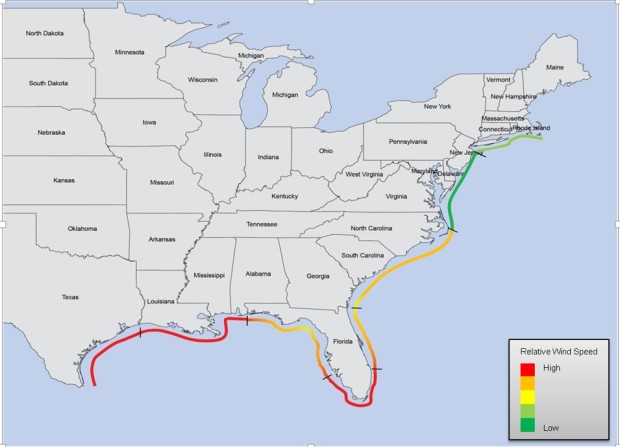
One can question the exact intensity of the 100-year hurricane or even argue that there is no precise 100-year storm, but experts can certainly define a hurricane that is representative or “characteristic” of a 100-year type event. Once the characteristic 100-year hurricanes are defined by landfall point, they can be run against your property portfolio to generate the losses you would experience from these events. For most companies, the graphic looks something like the following.
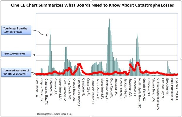
In this Characteristic Event (CE) chart, you see a wealth of information, and in particular where you will likely have the losses greater than your 100-year PML. Visualizing your loss potential when the probabilities are based on the hazard rather than loss can be an important, eye-opening experience. It clearly shows your PML is simply a mathematical number from an uncertain loss distribution and is not at all representative of any particular event. The red dots in the CE chart indicate your company’s share of the industry losses for the 100-year events.
While the probability of one of the “spikes” above your PML may be less than 1 percent, it would not be unexpected for any of these events and losses to occur. For example, if in 1992 Hurricane Andrew had made landfall 50 miles north, making a direct hit on Miami, the losses would have been four times higher, which translates to a $200 billion-plus industry loss today. This would cause losses well in excess of many companies’ PMLs but would not be considered a surprise or unlikely meteorological event.
The same would be true if a storm like Camille, another Category 5 hurricane, made landfall near Galveston-Houston instead of the Mississippi coastline, where it occurred in 1969. This slightly redirected Camille would cause industry losses in excess of $150 billion today even though the model-generated 100-year PMLs for Texas are on the order of $40 billion.
This CE chart also gives senior management more intuitive and consistent information with less uncertainty than the PMLs. If there’s no scientific reason to change the 100-year events from year-to-year, they can remain stable while the PMLs fluctuate, sometimes significantly. There’s no uncertainty around whether these 100-year events can occur—they are credible and realistic from a scientific perspective. There is, of course, some uncertainty around the losses these events will produce, but this is much less than the uncertainty surrounding the PML numbers that are based on simulations of many random variables.
Once you have this valuable picture of your loss potential, you can decide if you like it. If you’re uncomfortable with any of the spikes, you can refine your underwriting and pricing strategies to reduce the largest losses. You can focus in on areas where you have large losses and market shares. Perhaps the worst scenario for senior management and the board is a surprise large loss that’s also an outsized and unexpected share of the industry loss.
Because the 100-year events don’t change, boards can better monitor the impacts of risk management strategies over time. Clearly and systematically identifying your exposure concentrations, hot spots and market shares of loss enable you to better discuss and manage your “informal” risk tolerances.
This type of CE chart can be produced for all types of perils and is not limited to hurricanes. For earthquakes, for example, the 100-year events by seismic source zone can be inferred from reports and data provided by scientific organizations, such as the U.S. Geological Survey.
Boards typically don’t have time to wade through a sea of numbers on catastrophe losses, particularly when those numbers provide a lot of data but not enough information. Senior executives and boards require summarized and actionable information.
By estimating your losses from the 100-year events, in one succinct chart you get a wealth of information that clarifies and enriches the risk tolerance and risk management discussion, particularly at the board level.
If you’re not getting this information, you’re not seeing the complete picture of your catastrophe loss potential. To quote one senior reinsurance executive: “A picture is worth a thousand numbers.”
 Supply Shocks Beyond Hormuz: Other Ports Face ‘High’ Risk of Disruption
  NY Man Sentenced for Fencing Organized Crime Ring’s $4.4M Jewelry Theft
  How Doublet Earthquakes That Struck Venezuela Happen
  Executives on the Move at AIG, HDI, Everest Group and The Andover Cos.


